
Location Tracking
- Category
- Web Design – Landing
- Market Value
- 100K Dollar
- Start Date
- April 2024
- Client
- Confidential
- Tech-stack
- Figma, HTML5, CSS3, JavaScript, React.js
- Handover
- July 2024
Introduction
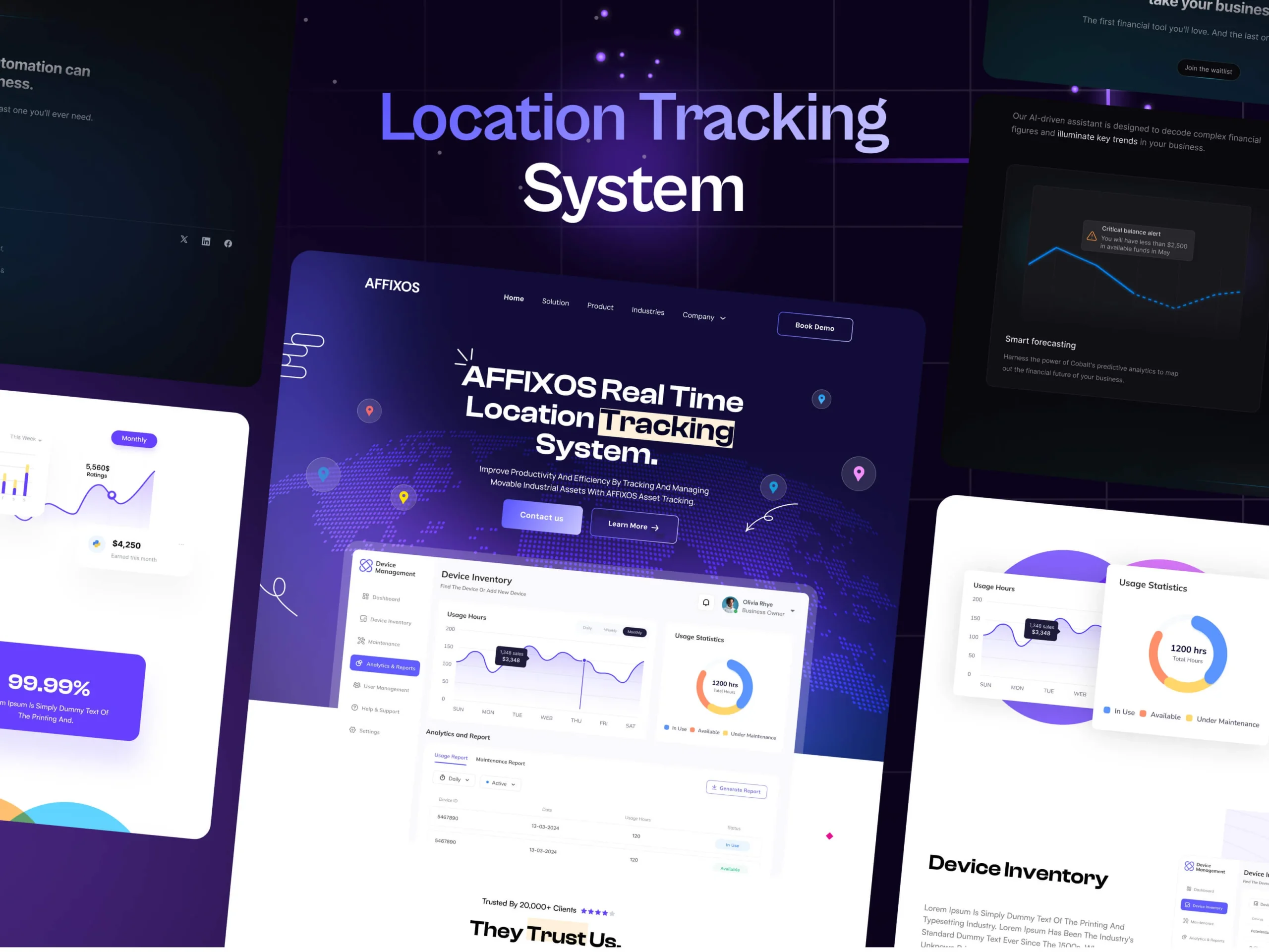
The Affiox Real-Time Location Tracking System landing page was designed to offer an intuitive and engaging first impression of a robust location-tracking solution. With a strong visual narrative, dynamic analytics displays, and carefully placed CTAs, the page seamlessly combines aesthetics and functionality. Every section—from the hero banner to interactive dashboard previews—was crafted to ensure clarity, build trust, and drive user engagement.
We aimed to create a landing page that feels modern and professional while effectively communicating the system’s unique value.

Project Objectives
The core focus of this project was to deliver a landing page that not only informs but also engages and converts.
Clear Communication
Highlight the core features and capabilities of the Affiox system.
User Engagement
Encourage interactions through well-placed CTAs.
Showcase Analytics
Highlight product capabilities with live analytics previews.
Build Trust
Include testimonials and trusted partner sections.
Drive Conversions
Optimize content flow for maximum lead generation.

Scope of Work
The project encompassed the design and structuring of a multi-layered landing page, each section serving a specific purpose:
The Hero Section sets the tone with an impactful banner featuring a dynamic map background, bold text highlighting “Affiox Real-Time Location Tracking System”, and actionable buttons like ‘Contact Us’ and ‘Learn More’.
Trusted Partners Section
Showcased industry leaders using Affiox for credibility.
Feature Highlights
Detailed functionalities, including Appointments, Class Bookings, and Fast Support with supporting visuals.
User Metrics
Real-time data on active users, accuracy rates, and performance summaries.
Device Management Details
Key insights such as device name, category, model number, and status.
Lastly, we ensured engagement with a Testimonial Section to showcase customer satisfaction and a CTA Section featuring an inquiry form and social media links.

Key Features
Every section of the landing page was designed with the user experience in mind, ensuring clarity and usability.
Dynamic Hero Section
Engaging visuals with clear CTAs.
Real-Time Dashboard Preview
Live insights into device activity and system performance.
Feature Highlights
Detailed breakdown of product functionalities.
Performance Analytics
Accurate data on active users and system efficiency.
Interactive Map Integration
Real-time tracking with detailed device information.
Customer Testimonials
Real stories reinforcing credibility and trust.
Design Process
Research & Discovery
• Competitor analysis to understand standard practices.
• User behavior analysis for landing page interaction patterns.
Wireframing & Prototyping
• Created low-fidelity wireframes for each section.
• Developed prototypes for interaction testing.
UI/UX Design
• Designed a clean and modern interface with visual clarity.
• Used intuitive color coding for medication types and statuses.
User Testing
• Collected feedback on usability and clarity.
• Adjusted design based on user insights.
Refinement
Polished visual elements and optimized for responsiveness.
Development Process
The development process focused on building a high-performance, responsive platform.
Frontend Development
Utilized React.js for dynamic user interfaces.
Responsive Design
Ensured smooth experiences across devices.
Real-Time Data Integration
Enabled live analytics and device updates.
Performance Optimization
Ensured fast loading and smooth transitions.
Approach and Communication
Project Kickoff
Defined goals, timeline, and deliverables.
Weekly Updates
Regular check-ins for progress review and feedback.
Collaboration Tools
Used Slack for communication and Trello for task tracking.
Documentation
Delivered comprehensive design and development handover documents.